Case Study
as i know, learning theory is a study about how people learn. there are 4 basic theory; behaviorisme, cognitivisme, constructivisme and neuroscience..These are one of the factors need to be considered in developing education sites.
Now, we go to another topic which is Web Design..this part is most important part in develop a program especially educational program..because our target user consists of student (primary,secondary or undergraduate student) and teacher..means, the users might have no advanced skill in using computer. so, we as web designer must know how to make a portable and accessible site to make it easier to access..
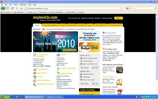
Next, Here is a my opinion of a characteristics of 2 web sites; the 1st one is online banking site, maybank2u and the 2nd is maxis website.


What the 2 sites have in common?
- The webpage shown was design for a 1024 x 768 resolution, but is adaptable to other resolution as well.
- As the screen resolution changes, the design fits without horizontal scrolling on even the lowest resolution.
- The menu listed on the top of the site.
- The information break into a segment.
- Both sites used white color as a background color. The contrast of text color make the information easy to read.
What are some rules of good design that you found from the websites and how you can use it in your project?
1) Make design portable
- When design page, it must portable and accessible by users who have different browsers, operating systems and computer platforms.
2) Design for low bandwidth
- Plan your page so that they are accessible at a variety of connection speed.
- If pages download slowly because they contain large, detailed graphics or complicated animation, user will leave before they ever see the content.
3) Plan for clear presentation and easy access to your information.
- Graphics and navigation options must present a variety of options to the user without detracting from their quest for information.
- The website should be easy to navigate. Every page should have consistent easy to understand links back to other pages. This means that there should be no dead ends.
Identify the information of value you found explaining how it was presented.
The design is simple but accessible. The multimedia elements that used in these websites are:
- Text - mostly used to represent the information.
- Text image - as a menu.
- Simple animation - using GIF format (means the size of animation is small)
- Graphics - Represent the logo and use for the banner.
Rate the ease of finding the information.
Both websites are useful in finding the information for their own category.
The using of navigation and the proper menu make the finding more easier.
The user can save time to explore the content that they want because it doesn't take a lot of time to load the pages.
Explain what would encourage you to make a return to each web site.
- Maybank2u - this website provide services to make payment and online banking. Although there are many online banking that provide the same service, but i prefer this site because it is more faster to access this site.
- Maxis -This website provide information about the recent technology and manual for the maxis user.


Comments
Post a Comment